Our “household Constitution” requires the Honeybee, who is the family’s household CFO, to deliver the family financial report every January to yours truly, the household CEO.
For years, the Honeybee has painstakingly tracked and recorded our finances using a Microsoft Excel spreadsheet. � Last week she completed updating that spreadsheet for 2009.
Having reviewed the latest numbers I am pleased to report that the state of the Penzo household is currently very good.
This report is divided into three sections:
1. Net worth estimate as of December 31, 2009
2. Long term financial performance since 1999
3. 2009 Financial Performance
The Big Picture
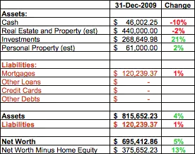
 As of 31 December 2009 the household net worth was just a notch under $700,000. � This represents a net increase of five percent from 2008.
Overall, assets increased four percent while liabilities increased one percent.
On the liabilities side, other than the mortgage, we have no loans, credit card debt or any other obligations. � That, ladies and gentlemen, is called financial freedom!
The mortgage balance increased by one percent last year because I made two tactical decisions: 1) � refinance my 15-year fixed-rate mortgage to a 30-year fixed-rate mortgage, paying a little extra up front in order to lower the payments even further to help cushion the financial impact of a potential job layoff; and 2) Taking the money we have been allocating for over a decade towards extra mortgage principal payments and temporarily holding it in a separate savings account. � Back in June 2009 I explained my reasons for temporarily holding back the extra principal in this article.
With respect to assets, I estimated our household personal property, which includes things like our two cars, � furnishings, jewelry, and collections. In January 2009 the house was officially appraised at $440,000; my local real estate blog noted that home prices in my community were essentially stagnant from the period from December 2008 to December 2009.
Cash holdings decreased largely in part due to a drop in the value of some stock options I am currently holding.
I track both our total net worth as well as net worth minus home equity. � I do this as a simple reminder to myself that our house is not to be considered a piggy bank that can be tapped whenever we have an urge to scratch an itch. � By this latter measuring stick, the household net worth is a much more modest $375,000 – although that represents an increase of 13 percent over the past year.
Long Term Financial Performance 1999-2009
This long-term data reveals trends applicable to typical households with a genuine commitment to living within their means. � These long-term data allow us to glean additional insights regarding the advantages and benefits of sticking to a disciplined budget that just can’t be seen over shorter periods of time.
Keep in mind that, because the Honeybee is a hard-working but unpaid stay-at-home mom, our household has relied on only one income since our first child was born in 1997.
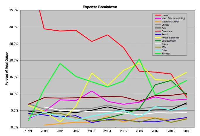
For those of you in your twenties and thirties, not to mention those who may be questioning whether early scrimping and saving is really worth all the hassle, just take at look at the next chart. � It is a graphical representation of the Penzo family household expenditures between 1999 and 2009 as a percentage of my total take-home income, which excludes withheld taxes, paycheck deductions for health and other benefits, and contributions to my 401(k) plan.

Let’s analyze some key areas of this graph.
Loans
Worst Performance: � 48.2% (!) of take-home pay � (1999)
Best Performance: � 8.9% � (2009)
Current Impact: 8.9%
Now, when looking at this summary chart of the household expenses over the past 11 years, the most glaring item is the red line on the chart. � This is the percentage of my take-home income dedicated to loans and, as you can see, in 1999 it was literally off the chart! � For the record, in 1999 exactly 48.2% of my take-home pay went to cover a car loan and the mortgage on my house.
My original goal was to get this number down to 38%. � My assumption for this was the generally accepted 28% maximum for the home loan and an additional 10% for auto loans. � I realize conventional wisdom says the percentage of take home pay devoted to the car loan can be as much as 20%, but I prefer not to devote that much money to an auto.
Generally, high debt-to-income ratios are usually the biggest hardship for those who are just starting out. The good news, however, is that over time those who hate to pay interest and choose to live within their means should expect to see less of their take-home income consumed by loans. � As the graph shows, this is clearly illustrated in my particular case.
Look at how that red line plummets over time! � Each time that red line drops the choking vice-like grip of your debt eases until, before you know it, you no longer even notice it!
For me, the first significant drop in loan expenses occurred in 2000 when we paid off our first car loan. � � We bought another car in 2002 but the loan on that car was retired in 2005, resulting in the second significant drop in loan expenses.
Key Takeaway: When you no longer are committed to servicing loan debt you suddenly find yourself with more money available to put towards…
Savings
Worst Performance: 1.9% (1999)
Best Performance: � 20.4% � � (2006)
Current Impact: � 14.0%
Next, we’ll focus on the lime green line that represents my contributions to savings. � Keep in mind this is only cash savings extracted from my take home pay. � It excludes my contributions, for example, to my 401(k) retirement plan that are automatically deducted from my paycheck.
Notice the impact that the loans had on our savings (not to mention all of the other expenses) in 1999. � That year we were only able to sock away a pitiful 1.9% into the emergency fund. � The irony, of course, is this is the very time when we were most vulnerable to defaulting on those pesky high loans that were eating up most of my take-home pay!
As time passed, however, we were able to begin building a significant savings cushion.
Key Takeaway: For those who can minimize their debt load, the ability to save increases over time.
Utilities
Worst Performance: 7.0% (1999)
Best Performance: � 5.5% � � (2000, 2001, 2006)
Current Impact: � 6.9%
Over time, our utility bills have thankfully managed to keep pace with my increasing take-home pay. � In 2009 equivalent dollar terms, our utility bills have increased over 30% over the period from 1999-2009. � I attribute a big part of that to the growing size of our household.
In equivalent-dollar terms over the past decade, here is a breakdown of how much our utility bills have increased:
Electricity: 4% increase
Natural Gas: � 4% decrease
Telephone/Cellular: � 54% increase
Sewer/Water/Trash: � 10% decrease
Cable/Satellite: � 175% increase (!)
Key Takeaway: Technology costs money. � If you aren’t careful, telephone and cable/satellite television bills can outpace the rate of inflation – and increases in your paycheck.
Property Taxes
Biggest Impact: 6.7% (1999)
Current Impact: � 4.4%
I am extremely fortunate that our property taxes, represented by the white line on the graph, continue to drop as a percentage of take home pay thanks to California’s Proposition 13. � I expect this number to continue to drop over the long run. � Before Proposition 13, property taxes were capable of doubling every couple of years, and putting significant numbers of people at risk of losing their homes to their inability to pay the outrageous taxes. � Hopefully, you live somewhere that has similar restrictions on property tax increases.
Key Takeaway: Count your lucky stars if you live in a place with property tax restrictions.
Groceries
Worst Performance: 10.1% (2009)
Best Performance: � 6.9% � � (1999)
Current Impact: � 10.1%
The trend is gradual but unmistakable. � The brown line that represents our household grocery bill is slowly increasing. � Since 1999 it has more than doubled in real dollars and I expect it will probably nearly double again over the next 10 years as our 12-year-old son, Matthew-the-Bottomless-Pit, begins to enter his teen years. � � Luckily my income has managed to keep up with the increase in the grocery bill over the last ten years, but I expect the slope depicted on the graph will begin to steepen just a bit over the next ten years or so.
Key Takeaway: Paybacks are a bitch. � I know I cost my mom and dad a fortune in groceries when I was a teenager and soon Matthew-the-Bottomless-Pit (God love him!) will be doing the same to me.
Bonus Tip: Yes our grocery bill is large, but did you know our food bill would be as much as 20 times higher if my family of four ate most every meal at a restaurant? � � You can see the complete analysis here.
House Expenses
Worst Performance: 19.2% (2006)
Best Performance: � 1.6% � � (2001)
Current Impact: � 16.5%
This category includes everything we spend to improve the house, from this year’s block wall, to our new energy efficient front doors. � From plumbing repairs to paint and home owners insurance. � We also include the exterminator visits, lawn care, remodeling expenses, and even the cost of the furniture and wall clocks. � As the house is getting older, a bigger percentage of the money is going toward maintenance and less is going to the other stuff.
Key Takeaway: The cost of owning a home is expensive and goes way beyond the mortgage.
As I mentioned in last year’s report, the long-term graph clearly shows that for younger households that are just starting out, say with a new house and car, by the time the everyday expenses are taken care of, there is very little left to devote to discretionary income. � The lesson here hasn’t changed: Serious household CEOs have to be extremely vigilant in ensuring that budgets are adhered to because the money here can be so tight that the temptation to pull out that credit card and run up a few charges that you can’t cover at the end of the month will be great.
Needless to say, the Honeybee and I really sacrificed in the first couple of years. � In fact, for the first couple of years, as you can see from the graph we did not even track entertainment as a separate expense because we spent so little on it. � � At that time, our entertainment was basically tracked by our ATM withdrawals.
But the same graph should inspire you, for it clearly proves that disciplined households that are committed to achieving financial freedom will begin to reap the fruits of their hard work in a relatively short amount of time.
2009 Financial Performance
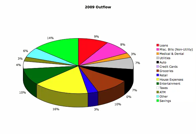
Finally, here is an illustrative breakdown of my �outflow�, or expenses, for the year in the form of a pie chart. � � The money that makes up the pie chart comes entirely from my take-home pay, which excludes withheld taxes, paycheck deductions for health and other benefits such as additional life insurance, and contributions to my 401(k) plan.
So, in essence, this represents how we chose to allocate our take-home pay for the year.

As you can see, the chart is broken up into various categories. � Essentially, by looking at it you can see that three percent of my take home in 2009 went toward medical and dental expenses, while fully ten percent went to groceries.
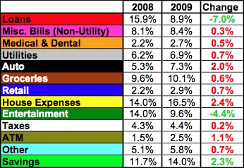
 The chart to the right shows the changes in where the household income was allocated from the previous year.
On the positive side, I am happy to see that, thanks to the home refinance we did last January, the household had seven percent more take-home income to allocate to other areas in 2009. � In fact, our only liability is the mortgage and it takes up a measly nine percent of my take home pay.
The mortgage is low enough now that even if I did get laid off from my high-paying engineering position, we would be able to make our payments for probably years (barring a catastrophic health event or natural disaster) even if I was unable to ever find a similar job.
The entertainment expenses were lower because last year we didn’t go on a major family vacation, unlike in 2008 when we went to Maui for ten days.
Thanks to the lower mortgage bill in 2009, we had more money to devote to our savings.
On the down side, we spent more money last year on maintenance for our aging (but paid for!) automobiles, and our house which is now 12 years old and getting to that stage where things are starting to need replacing. � � The biggest expense last year was our decision to spend almost $7000 to replace our dilapidated wood fence with a brand new block wall.
Well, that’s it for this year’s report.
In Conclusion…
I can’t impress upon you enough the power that keeping track of your finances gives you. � Another benefit of keeping detailed records like this is it instills an immediate sense of purpose toward improving your financial situation. � It also allows you to set goals.
If you aren’t already doing so, I hope this report encourages you to take control of your own finances.

Too bad you are the one hosting the carnival of the “best in personal finance” because if anything, this is a contender for the best post of the year. Sure, some folks show reveal their “balance sheets”. But you show a 10 year history.
This is the real deal.
You are perhaps the rare breed of pf bloggers who “walk the talk”. Hats off to you.
P.S. – Honeybee must know her excel very well!
Now, when you present this information to the rest of your family, do you force them to sit on different sides of the living room and clap–or hiss–depending on their party affiliation.
I think you should try it.
Good one! LOL Come to think of it… My family does that to me on a daily basis – whether I’m presenting the State of the Household address or not, Matt. LOL
Just out of interest, what would you class as other? I’m just wondering so I can get an idea of what might go in my “other” category so that I can allocate a proper amount to it.
Thanks!
It is essentially a catch-all, Jon, for everything that does not have its own category. Here is just some of the things we put in there: tax software, school pictures, year books & school lunch money, kids’ music & art lessons, fees for reordering checks, and office supplies. That is just a small sample. Hope that helps! 🙂
Very illuminating!!! Great detail, and I liked how you looked at worst and best years by percent. A little tip my husband and I have always used to keep spending in control is to think about the long term pleasure we expect to derive from our spending. It really helps us decide what to spend our money on!
Thanks, Barbara! That’s a great tip. So much of our discretionary spending results in short term satisfaction, even though we may end up for it over a very long time.
This is pretty impressive stuff, both the numbers and the analysis. Your (and Honeybee’s) attention to detail is surely the reason you guys have been so sucessful.
Way to go Len.
Wow. What an impressive, detailed look at your finances. I’m going to go through this a few times and look at it in further detail. Thanks for the transparent look!
Len, Very impressive. You have this stuff under control. That 11 year 1999-2009 graph of expenses is pretty enlightening; it must be relieving to see ‘loans’ come down like that!
Wow, very detailed! I may just have to steal this idea from you. My honeybee isn’t much of a CFO though… Maybe a CFO in training 😉
Thanks for sharing the details, you are obviously doing GREAT.
I love this note:
Cable/Satellite: 175% increase (!)
If I were you I’d give up cable so you can afford to feed Matthew :-).
@Mr CC: Hey, thanks for those kind words! As I’ve stated before on this blog, fiscal responsibility isn’t some new religion I just recently picked up because the economy went into the toilet a couple years ago. I do pride myself on ALWAYS having had this spend-less-than-you-earn mentality, even in the heady years leading up to our Great Recession when people were using their homes as piggy banks and living way above their means. A lot of those people are friends of mine who used to look at me as if I was the one who was crazy when I “failed to take advantage” of the housing boom and all of that cheap credit that was out there to anybody with a pulse.
@Bret: Thanks, Bret. The Honeybee and I are both very organized – often to a fault.
@20s: Thanks. Let me know if you ever have any detailed questions. I’d be happy to try and answer them for you.
@pkamp3: Regarding that red line representing the loans, it is VERY relieving. The best part though is, time acts as a financial pressure relief valve that really relieve the stress that comes with large financial obligations. The key is to ensure you stop piling on debt on top of debt – otherwise time ceases to help.
@Dustin: By all means, PLEASE steal this idea if it is going to help you reach financial freedom sooner! This stuff ain’t rocket science – I *know* your honeybee can do it!
@Susan: If the cable (now satellite) bill does continue to rise at that pace, I may just have to. 🙂
Excellent report..love the graphs and pie charts…y’all are on top of your game for sure. I found another role model 🙂
I think the charts and graphs really help us to see exactly how the money is being spent and, more importantly, the trends that reveal where progress is being made and/or potential trouble is brewing. I’m glad you enjoyed the report, Ken. 🙂
Damn, you rich Len! Can you share the wealth with me?
I’d really appreciate it. Thanks!
Unfortunately, Sam, a good chunk of that money has yet to be taxed. So I’m not as “rich” as it seems!