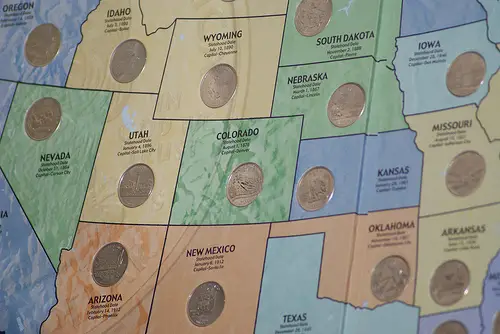
 It’s hard to believe, but ten years has passed since the US Mint’s very successful 50 State Quarters program ended. The program was a 10-year initiative that honored each of the nation’s states in the order that they ratified the US Constitution or were admitted into the Union. Each quarter was only minted for a brief 10-week period, and will never be produced again.
At the time, it seemed like everybody was collecting these quarters; I completed my collection not long after Hawaii’s was released in 2008.
Anyway, the other day I opened up my specially-designed album that holds all 50 quarters and marveled at the varied designs. Some quarters were quite beautiful. Others … well, not so much.
With that in mind, here are my nominations for the five worst US State Quarter designs. How do mine line up with yours?
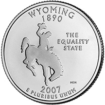
5. Wyoming
God bless Wyoming. I’ve visited 45 of the 50 US states, and I think it’s among the most beautiful. Part of Wyoming’s charm is its sparse population; fewer than a half-million people live there, which probably explains why Wyoming was unable to find a creative artist for their quarter. Although most of Yellowstone National Park is in Wyoming, the designer decided against featuring it. Why? On the other hand, this would have been one of the best quarters if Wyoming’s state motto was “Beef. It’s what’s for dinner.”
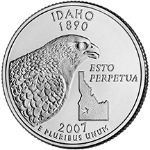
4. Idaho
I’ll never forget the day I received my first Idaho quarter. Looking at it begged the obvious question: How could Idaho fail to go with a design centered around its famous potatoes? Then again, maybe they didn’t; my apologies if the state motto that graces the quarter, Esto Perpetua, is Spanish for “Pass the home fries.”
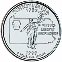
3. Pennsylvania
I realize Pennsylvania was the second state to join the union, which meant that they had less time than other states like, say, Alaska, to come up with their design — but come on. Frankly, I expected a lot more from the great state of Pennsylvania. The designer clearly put very little thought into this. Where’s the Liberty Bell and Independence Hall? As for centering the design around Miss Penn … Let’s just say the Quaker Oats guy — or even Ron Jaworski — would have been more interesting.
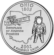
2. Ohio
My parents are from Ohio and I still have relatives who live there. That’s why it pains me to include the Buckeye State here. In Ohio’s defense, the final design isn’t really their fault. I know what they were trying to achieve. Even so, every time I see that space man, all I can think of is MTV.
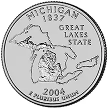
1. Michigan
Kindergarten teachers: If you want to have some fun, then give the Michigan quarter to your kids and ask them what they see. Talk about a Rorschach test. Every clinical psychologist should carry one of these quarters with them — just in case they get an emergency call. After staring at this quarter, I see a collection of human organs: a liver in the upper left; pancreas in the lower right; even an inflamed gall bladder. And if you look really carefully, some people say you can see a male appendage too.
You know … on second thought, showing this quarter to the kids probably isn’t such a great idea after all.
Photo Credit: bradleygee (map); US Mint (coins)
***
(This is an updated version of an article originally posted on February 2, 2010.)

I’m pretty sure the “spaceman” is Wapakoneta, Ohio’s own Neil Armstrong – the most underpublicized man on Earth, relative to his accomplishments.
Interestingly, 25 astronauts hail from Ohio, including Jim Lovell. John Glenn, and Judith Resnik (lost on the Challenger).
Len: John Glenn was the first American to orbit the earth but I think Alan Shepherd was the first American in space.
I think Iowa quarter should be on the list.
I don’t think it is funny The iamge on reverse quarter is the actual image of Michigan. I don’t see any worse about Michigan. The quarters representing all 50 states are equally worse Period
You can add Alabama to the list as well. It’s great to put Helen Keller on your quarter, but the attempt to put lots of detail in metal just left her looking like an amorphous blob of an old woman in a chair. “Alabama – Grandma’s welcome!”
I just want to know, How the blue blazes did a Peregrine Falcon end up on the Idaho quarter? I’ve been to Idaho several times and camped in the sawtooth’s but I have NEVER seen a Peregrine Falcon there, now Colorado, that’s a different story.IMHO I think that Kentucky SHOULD have been represented, Idyllic pasture scene with a horse and My Old Kentucky Home, granted all reconizable, but it should have been more like a giant distillery pumping out gallons of alcohol, and tended to by a overly obese man in overalls and 10 kids piling on wood to stoke the fire.
From what I read, the governor picked the peregrin falcon because they had some peregrin falcon sanctuary or something that was doing a lot for the peregrin falcon in Idaho. Which is still a stupid reason, you’d think they’d want to celebrate something historical.
How was it determined it was a male on the Wyoming quarter?
The main symbol in the bucking horse-It is based on a real horse name Steamboat that was know an the horse that couldn’t be ridden. He was ridden by and working cowboys, but later was in the rodeo circuit. He was born in 1896 on the M-Ranch outside of Chugwater, Wyoming and this symbol is on the Wyoming license plates. There is a plaque at The National Cowboy Hall of Fame in Steamboat’s honor. The cowboy is just a nameless cowboy doing his best to stay on.
Wyoming’s motto “The Equality State” comes from the fact that Wyoming is the first place (a territory at the time) in the US to grant women the right to vote-in 1869. It also is the first state to allow women on a jury and it had the first woman governor.
Both the image and the motto are historically correct and they can coexist with no problem.
Well said Gary. I personally like the Steamboat symbol. It is simple and describes a lot about the culture that was and is Wyoming. I am from Florida but my wife and her family are all from Wyoming. I am fascinated by the culture every time we visit.
They threw out my idea in my home state of Washington. A profile of George Washington. Wait you say, there already is a profile of George Washington on ALL quarters. hmmmmm.
Yeah, Michigan’s the “Great Lakes State” but Lake Ontario doesn’t even touch Michigan. They could’ve left it off and made the rest of the map that much bigger and more visible.
Or at least had the St. Lawrence delta running off the side of the coin so that Lake Ontario doesn’t look so much like a foot.
On a few of the coins the relationship between the art and the state is so obscure that the people in the state don’t even get it. The NY coin does have the Statue of Liberty, but then on the state shape you’re supposed to know that the squiggly lines on the state are the Hudson River and the Erie Canal. And how many people know the state grain of Wisconsin is corn? And I’m sorry, but the buffalo on the Kansas coin is just wrong.
While Arizona has art that is representative of the land, New Mexico put their old license icon on theirs. Connecticut has the Charter Oak, (which I really like), but because the oak was destroyed in 1856, and what passes for history that’s being taught in our schools, few know why the tree is important.
In the US, coins, like postage stamps, are chosen by strange and arcane methods. And sometimes the crap floats to the top and gets chosen, which is a shame because we have so many wonderful things in this country. In every state there is beauty and things the people KNOW and love. Add that to the artists and technology we employ in of our minting system and you begin to realize the options amazing.
The reason the National Parks didn’t go on the “state” coins is probably because they have a set of National Parks Coins, as well as I think 6 Territory Coins.
I’m not sure why you would take issue with a buffalo on Kansas’ coin-There were thousands of buffalo there. I can understand maybe taking issue with them being pushed out and slaughtered.
The New York coin depicts the Hudson River and the Erie Canal because both waterways are so important to the history of the development of the state and the US. The Hudson River played a key role in the early settlement and the original 13 colonies/Revolutionary War (West Point is on the Hudson), and the Erie Canal was a route West, connecting NY harbor via the Hudson River to the Great Lakes in 1825 when there was no other means of travel but horses.
I guess you have to know a state’s history to appreciate many of the quarters.
I also live in Idaho and I believe the consensus among Idahoans is that the folks in charge of our quarter design really blew it. Rumor has it that the story behind the horrible design is this…Idaho’s Raptor Recovery Center played a role in helping to protect the bird from extinction. Which is great (although not a well-known story, even among we Idahoans). Our governor at the time, Dirk Kempthorne, chose the design. Several months later, he was appointed by George W. Bush as the Secretary of the Interior. Hmmm…interesting.
Gah, Michigan’s is garbage!
I think you did a good job with the list. When I see Ohio I think of three other states first because of the space man. Florida, Texas, and Alabama. Why is he on there anyway?
I really enjoyed this! And I totally agree- Idaho is so ugly!
But I really like Wyoming. 🙂
I always thought of Idaho as a picture of some kind of giant pre-historic bird that was several times the size of the entire state of Idaho.
I am a non-native of Wyoming, and have learned that the one college in the state has a mascot of the Cowboys. The cowboy seen on the quarter is the college logo. No excuses, ‘just is what it is.
That makes it even worse. They just copied and pasted it from an existing logo.
The Idaho quarter is terrible, I live in Idaho and we could have done so much better, like a salmon, trout, mountain goat or the Sawtooth Mountains. GEEZ
Or sun valley skinhill
Hahaha, as a Wisconsinite all I see in MI’s quarter is WI.
And a big mess.
I know what the Great Lakes look like, and what MI looks like, but this is a big gross mess.
We got our quarter right!
Yes… because nothing says “timeless, classy design” like a big old cow head next to a hunk of cheddar cheese. Good job, Wisconsin! If the Wisconsin quarter were scratch-&-sniff, I’d expect to smell cheese curds or manure. Wisconsin should have been in the top 5, along with:
Florida – Nice montage; almost as classy as a 1980s arcade token with that space shuttle on there
Iowa – A one room school, lifeless, flat and forgotten! Just like our entire state!
Indiana – A NASCAR car!? And not from the Southern state? Finally, something to offend people with good taste AND rednecks alike…
It’s funny the things other people see that are so obvious when pointed out (like the person who only sees WI). I’ve lived in MI all my life and when I saw MI @ the bottom of the list I thought, “What’s wrong with our quarter (other than it being a little boring)?” Then after reading this I realize that I only see the image clearly because I’ve been looking at it all my life, and that it really does look like a Rorshach test. Maybe the people who made the quarters were similarly “blinded” by what these look like to outsiders, because they’re images they’ve seen all of their lives.
The Michigan quarter is actually very interesting:
a.) It shows the adjoining Great Lakes i.e, Superior, Michigan, Huron, and Erie, with Lake Ontario to the North-east but not adjoining Michigan;
b.) It shows the subtle low relief of Michigan, including the Gogebic Range in the western U.P, and the Porcupine Mountains in the U.P;
c.) It shows the interesting geography of Michigan, with its Upper Peninsula and its Lower Michigan, also its Isle Royale (National Park) offshore of Thunder Bay, Ontario in Lake Superior.
In regards to the Wyoming quarter and the “cowboy” on the design. It is actually the State of Wyoming logo and is a registed trade mark. The University also uses it. Any why would a state that is know as forever west not have a cowboy featured on it? Just sayin!!!
Nevada quarter is the best.
New Hampsire’s is pitiful. The old man on the mountain fell into the valley…the people of that state way overvested their emotional attachment to a rock that wouldn’t get a second look in most western states.
Thumbs up to the states that resisted using an outline of their state in their motif.
I agree; using the state’s outline in the design was pure laziness, Derf.
The New Hampshire coin became kind of irrelevant after the Old Man collapsed into the valley. I remember when it happened and I immediately thought “Well, so much for NH’s state quarter!”
Greetings from Los Angeles! Awesome blog, Len!
Thanks, Freddy! Looks like we’re neighbors!
The worst part of the Michigan quarter is that it includes part of Wisconsin and Late Ontario
Michigan doesn’t border Lake Ontario … not even kinda!
I love the image of Steamboat on the Wyoming state quarter, and truthfully I would have been disappointed if they had used anything else.
I have to whole-heartedly disagree with your opinion concerning the Wyoming state coin. I find the simplicity of the design to be outstanding. It may not be gorgeous like Connecticut or Mississippi but it will convey the correct message 2000 years from now. The dastardly Pennssluyvia coin design is the result of letting government bureaucrats pick the winning design.
I agree with you on PA, bags.