 I’ve always been fascinated by maps. Throw me a map of anyplace and I can be mesmerized for quite a long time. Don’t ask me why; it’s just how I am.
So I guess I shouldn’t be too surprised that the other day I spent almost a half hour poring over a very interesting map of the United States that I stumbled upon while surfing the Internet.
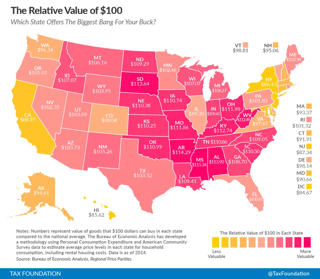
The map, created by the Tax Foundation, shows the real value of $100 in each state, based upon data from the Bureau of Economic Analysis. More to the point, the map shows exactly how much “a Benjamin” in your wallet will buy you, depending on where you live.
It’s no secret that prices for the same goods and services are often significantly lower in states like Mississippi and North Dakota than they are in states like Hawaii, New York and California — which is why the same amount of cash buys more in a low-price states than high-priced ones.
The question is: How big is the difference on a state-by-state basis? Thankfully, using the map makes it easy to compare. As the Tax Foundation’s Alan Cole explains:
Ohio is a low-price state. There, $100 will buy you stuff that would cost $111.98 in a state at the national average price level. You could think of this as meaning that Ohioans are, for the purposes of day-to-day living, 11 percent richer than their incomes suggest.
Cole also makes another important observation: The trick is to find a low cost-of-living state where you can secure a higher-paying job:
It’s generally the case that states with higher nominal incomes also have higher price levels. This is because there is a relationship between the two: in places with higher incomes, the prices of finite resources like land get bid up. But the causation also runs in the opposite direction. Places with high costs of living pay higher salaries for the same jobs. This is what labor economists call a compensating differential; the higher pay is offered in order to make up for the low purchasing power. This relationship isn’t the only thing that matters. Some states, like North Dakota, have high incomes without high prices.
Of course, this fact leads to misperceptions regarding household wealth. For example, as the Tax Foundation points out, although Nebraskans and Californians earn approximately the same amount in dollars per capita, Nebraskan incomes go a lot further, after adjusting for regional price parity.
Think about that before you decide where you want to raise your family — or spend your golden years in retirement.
Photo Credits: Tax Foundation (bottom); Wei Hsin Li (top)


I was actually surprised NY and CA weren’t lower on the scale. Very cool post and chart.
Thanks, JB. I’m actually surprised by that too — especially New York.
Well most of the states are prospering, hope the election & new reforms bring much more to the small states.