 The way that economic data is presented, we often think of inflation as a singular number representing a general increase in prices.
For example, it might be reported that nominal GDP growth was 3%, and that inflation was 2%. Since the inflation represents a rise in price levels, we subtract it from the nominal rate to get a real GDP growth of 1%.
But in reality, price changes do not affect products and services in such a uniform and simple fashion. In the above example, all goods aren’t increasing in price at a 2% rate — that’s just an average. What really happens is that there is a full spectrum of price changes: some goods end up falling in price, while other goods get more expensive, as we first illustrated at the Visual Capitalist:
What’s Actually Getting More Expensive?
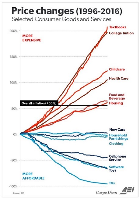
The original chart, provided by Mark J. Perry of AEI’s Carpe Diem blog, is also very telling. It looks at the change in prices of consumer goods since 1996:
The average price increase, as shown by the CPI (Consumer Price Index), is 55% over the last 20 years. Meanwhile, the prices of individual sub-categories have a much wider variance.
The good news is that the price of technology is generally getting cheaper. Software, TVs, wireless, and new cars have all come down in price relative to the CPI. Clothing, toys, and furniture are also way more affordable than they were 20 years ago.
The bad news? Most of the above items are not the ones that really matter to most of us. The things we actually need to live healthy and fruitful lives — education, food, healthcare, childcare, and housing — are all skyrocketing in cost.
Tuition costs have soared 197%. Textbooks have more than tripled in price, going up 207% since 1996.
Taking care of our loved ones is more expensive. Healthcare and childcare costs have risen almost as much: 105% and 122% respectively.
Meanwhile, basic necessities such as shelter and food have increased at rates higher than the CPI as well. Housing costs are 61% higher and food is 64% more expensive.
Photo Credit: NASA; Infographic: Visual Capitalist; Graph: Carpe Diem


Great post Jeff. This is the kind of thing that I’ve seen in my personal life, but it hasn’t REALLY been reflected in the headline results. I guess most reported inflation stats exclude the volatile food and energy component.
New car prices stayed the same for the last 20 years. Sure:-) BLS manipulates the numbers very well. The cheapest car back then cost about 6k, now it is at least 15k. Hmm…
New car prices? B.S., makes the rest of the numbers seem suspect.
The rest of the numbers seem accurate, why the new car rate is near “0” is baffling
The number is near 0 because of some disinflationary bureaucratic hocus pocus called “hedonic adjustments.” The “logic” behind hedonic adjustments is that over the past years new cars have acquired advanced features, capabilities, improvements and performance (e.g., higher MPG, increased towing capacity for trucks, back-up cameras, nav systems, etc.) that offset the numeric price increase.
Yes, it’s BS.